Nike's Men Vs. Women Series
Intro
In 1959, Oregon University track coach, Bill Bowerman had a strong desire to create a better running shoe. He wanted a running shoe that was not only lighter, but also more durable. Running as one of his track and field athletes was Phil Knight, whom wanted to make money, but without having to give up his passion for sports. Between the two and their marketing strategies, one of the most well-known and influential companies in the world of athletics was born. The two sparked the beginning of Nike. Accompanying the duo was Caroline Davidson, whom created the famous Nike swoosh logo in 1971, which symbolized the wing of the Greek Goddess, Nike. In 1972, the first Nike shoe with the swoosh logo was presented, having an everlasting impact on the world of athletics.
For years, Nike has been one of the most prestigious companies in the world of athletic apparel and likewise. However, that wasn't enough as in 2009, Nike ventured forth and started a new campaign known as the “Men Vs. Women Challenge” sparking endless competition between men and women to see which truly is the superior gender. And who doesn't like a little bit of competition or want to be in great shape? This campaign was definitely a good motivator for people to get in shape as well as prove which gender is superior, resulting in an increase for the demand for running apparel; causing consumers everywhere, athletic and out of shape individuals alike to “Just Do It” and purchase Nike’s athletic wear.
Behind the Scenes
In the background are the people who made this campaign possible. The credit goes to 72 and Sunny, director Tim Godsall, and the the digital company, AKQA. 72 and Sunny is a prestigious agency that has been nominated as "Agency of the Year" by Ad Age and Adweek for the past two years. Furthermore, they have agencies all over the world and have done work for clients such as Activision, Starbucks, Google, Samsung etc. Next, AKQA is an “ideas and innovation company.” AKQA exists for the sole purpose of creating the futures of any of their clients. Lastly, Tim Godsall is a very influential commercial representative. All of these groups teamed up and made a very solid campaign.
Audience
The target market or audience is a very broad one. Truthfully, anyone can pursue fitness, even from a young age. However, to narrow down the demographics a little bit, the age would likely be ages thirteen and up because the teenage years and on is most commonly the period where being in shape is considered to be something of importance. Furthermore, race or ethnicity is not an issue either. Generally, as long as the individual is male or female, they are being targeted by the ads. The campaign hits a very broad spectrum of people and uses several different strategies to attract customers.
One method utilized to attract customers was the celebrity spokesperson tactic with Eva Longoria Parker, Tony Parker, Roger Federer, etc. to persuade the consumer that if a celebrity does it, they should as well. The celebrity spokesperson technique also triggers a bandwagon effect. Males and females both want to fit in and feel like a part of something big, and what better way than to join their respective genders in the battle to prove which is the superior gender? Furthermore, the next two actually go together. Using the glittering generality technique would strengthen the belief that one gender is better, and when that happens, emotional appeal is used to draw out the passion and competitive side of each gender. Lastly, by making men and women feel they are superior and part of an elite group, they fall under the spell of not only snob appeal, but they also fall under the effects of the sex appeal strategy. Altogether, these methods target a very broad spectrum of different people efficiently and effectively.
About the Ads
Ad#1

Ad#2

On the contrasting side of the campaign is the women’s version of the ad saying, “Ladies first. Men second,” The point of this ad was that "ladies first" doesn't just stop with manners. In fact, it actually continues with running because according to the ad, women will also be first a the finish line. By arguing that women are superior, Nike aims to motivate women to buy their products and start running as well. The target market being women everywhere that want to start getting in shape as well as proving who the superior gender is. Evidently, the women know they are better as they confidently race forward in Nike apparel. The colors in this ad also mean several different things. Blue is the color of authority. Perhaps the purpose of the placement of this color was to make the women feel in charge and put the men in their place during the competition. Light Blue is the color of confidence; just the color needed to make the women feel like they are going to dominate the competition. Pink is the color of love, as previously stated. Obviously the men are not the only people that enjoy a little bit of cardio as well as competition. Red is the color of energy and in this add, it is likely that it means the women are feeling energized and ready to win
Ad#3

Another ad in the Men Vs. Women series, once again aiming to please women says, “Custom fit for girls. Trouble for guys.” This ad appeals to a more specific group of women wanting to prove the superiority of their gender. In fact, this ad more directly aims to please women that require special fitting needs whether their feet are wider, have high arches, or flat. Nike is trying to say that with the use of their shoes and other shoe products, women will easily give the men a run for their money. Furthermore, the different colors in this ad also impact the message coming from this ad. The blue, yellow, and red have previously been explained in the other two ads, however one difference in this ad is the green. In this particular ad, the green would lean more towards ambition. By giving women the assets they need, Nike likely intends to make women feel ambitious about their fitness and ambitious about causing the men trouble in the competition.
Ad#4
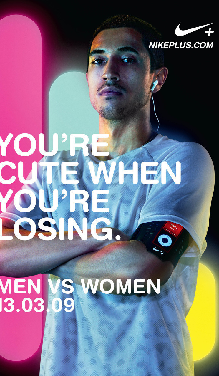
The last competitive ad in the series aimed directly towards men says, “You’re cute when you’re losing.” In this ad, it is implied that the meaning was women being on the losing side as it has a picture of a man running with those words on the page. By saying that, it is shown that men are not taking women seriously, and that they expect to win the challenge without struggling. According to this ad, men are the superior gender.
The Big Picture
Overall, the goal of this campaign, was to spark the competition between men and women to prove which gender is superior. While it is like comparing apples and oranges, the campaign did an adequate job of promoting Nike and trying to get people active because the ad appeals to anyone. Not just athletic people, or people needing to get in shape, but any male or female out there. Whether or not they believe they are the better sex or if they simply enjoy the atmosphere of being in a heated competition. Ultimately, this campaign was a brilliant way of acquiring more customers. With men and women all over the globe competing to prove which is the superior sex, Nike will sell more than ever before. 
Works Cited
"Men vs. Women Challenge Ads: Nike Fuels Sex Wars With New Campaign." TrendHunter.com. N.p., n.d. Web. 02 Nov. 2014.
"AKQA." AKQA. Web. 11 Nov. 2014. .